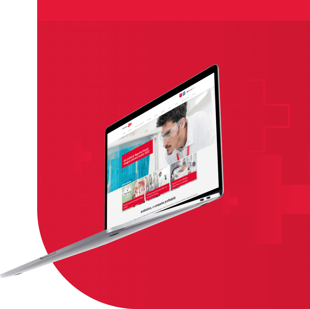
Redesigned for relevance: How we helped Antibiotice reach their true audiences
In this article, we’ll show how we helped Antibiotice, one of the largest pharmaceutical companies in Romania, go from a generalist website to a smart…
By Grapefruit teamPublished Updated 4 min read

In this article
We all know sleek animations, sharp visuals, and clever headlines make beautiful websites, but in B2B, clarity beats beauty. A website is where people come to do things. And when the industry is pharma, and those people are as different as job seekers, investors, healthcare professionals, and business partners, your website needs to be focused on purpose-built user journeys more than on aesthetics.
In this article, we’ll show how we helped Antibiotice, one of the largest pharmaceutical companies in Romania, go from a generalist website to a smart, segmented platform that works for its audiences, without drowning in complexity.
The cost of ignoring audience-specific needs
Most corporate websites try to do everything at once: present the brand, list the products, talk about career opportunities, and impress potential investors. The result? A digital maze. You may check all the content boxes, but you leave real users digging through pages. That’s where we came in. Antibiotice didn’t need more content; they needed better structure, and they needed focus. Our task was to give each key audience exactly what they came for, without making them hunt for it.
Step 1: Know your audience
Before writing a line of code or sketching a single wireframe, we needed to understand Antibiotice’s audiences. Not just on paper but in real use cases and real journeys. We spoke to teams, we toured the facilities, and we asked a lot of questions. We needed to understand what investors are looking for when they land on a pharma site, what applicants expect to see when they’re considering a job, and what a business partner might need on the go. It’s the kind of insight you can’t get from a brief, you get it from being there, listening, and connecting the dots.
Designing with intention
Every section, every block, and every call-to-action on the new site was designed with an audience in mind. Not a generic "visitor", but someone specific with a clear goal.
- Investors needed fast access to financial data, annual reports, and news that impacts stock confidence.
- Job seekers wanted clarity on open positions, benefits, and a straightforward way to apply.
- Healthcare professionals needed private access to product documentation and specific contact points.
- Partners required content that speaks their language, whether they were local distributors or international buyers.
By acknowledging these distinct groups and mapping their journeys, we created a structure where each person found their way without friction.
Sketch. Test. Repeat.
We sketched like mad scientists, then we validated, then we redesigned. This wasn’t just for fun, it was a practical way to identify exceptions in flows before wasting hours on polishing the wrong idea. By starting with sketches, we stayed flexible and grounded in user thinking, instead of rushing into visuals that distract from function. We made sure we built templates that could handle real-world content variation and different user scenarios.
Designed to be responsive by default
Mobile design wasn’t just a checklist item, it shaped every decision we made. In pharma, mobile experiences are often overlooked, but we knew that partners and applicants rely on their phones just as much as desktops. That’s why the new website was built to perform smoothly across all devices, with clear content hierarchy and layout shifts fine-tuned for every breakpoint, in close collaboration with the development team.
Empowering the client through CMS simplicity
We didn’t just deliver a polished website and then walk away. We built a CMS tailored for real-world use, so the Antibiotice team could easily manage and update content without relying on a developer. Furthermore, we guided them through every step, ensuring full confidence and control over the platform. The result? True autonomy, without the technical headaches.
Results that matter
The success wasn’t in how modern the website looked, although it does look sharp. It was in how easy it became to use. Investors could find what they needed fast; applicants could apply with minimal steps; each user felt like the website was built for them, because it was. Navigation was cleaner. Bounce rates dropped. Key pages were easier to find. Most importantly, Antibiotice had a website that finally worked for their people, not just their brand team.
You can read more about that in the case study.
Final thoughts: Focus wins
In digital, relevance beats reach. You don’t need to please everyone, you need to connect with the right people. And your website is often the first (and sometimes only) place that happens. If your brand is trying to speak to too many audiences at once - or worse, to a vague “general public” - it might be time for a rethink. Not necessarily a full redesign, but a sharper strategy.
At Grapefruit, we help brands communicate with precision. We cut through the noise, segment what matters, and craft digital experiences that speak clearly to the right people - the ones who act, buy, and stay. If your brand message feels blurry, let’s sharpen it together!