Telekom Romania
Telekom Romania: MyAccount self-service app designed for iOS and Android
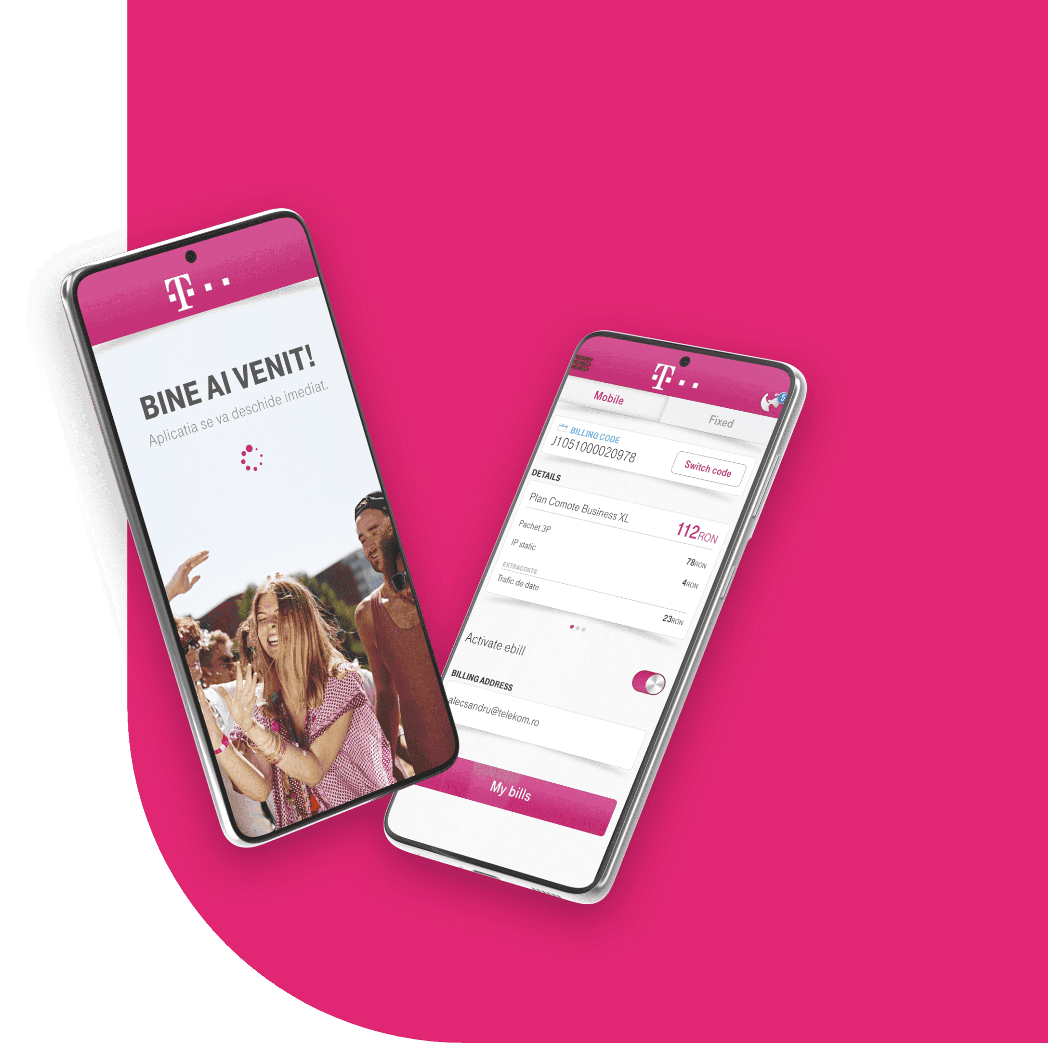
After redesigning Cosmote.ro and Telekom.ro, Grapefruit designed the experience of MyAccount, Telekom Romania's official self-service app for iOS and Android. Over almost two years the team mapped flows, sketched and tested screens on devices, built a visual style consistent across both platforms and prepared assets for every Android screen density.
Key results
Results being verified
We only publish numbers the client has confirmed. The outcomes for this project are being verified; the scope and deliverables below are final.
Context
Overview
Context
Requirements
Gathering the specs was a straightforward process. We got the required amount of information to get us started. We tried to lay down the foundation first and then make brick by brick.
Process
Flow & Use cases
With the main requirements set, we now started thinking about the whole experience the user had to indulge: from start right to the finish and beyond. Why beyond? Well, we had to take into consideration important factors such as “how will the user return?” or “how are we going to match behavior between mobile and website account?”.
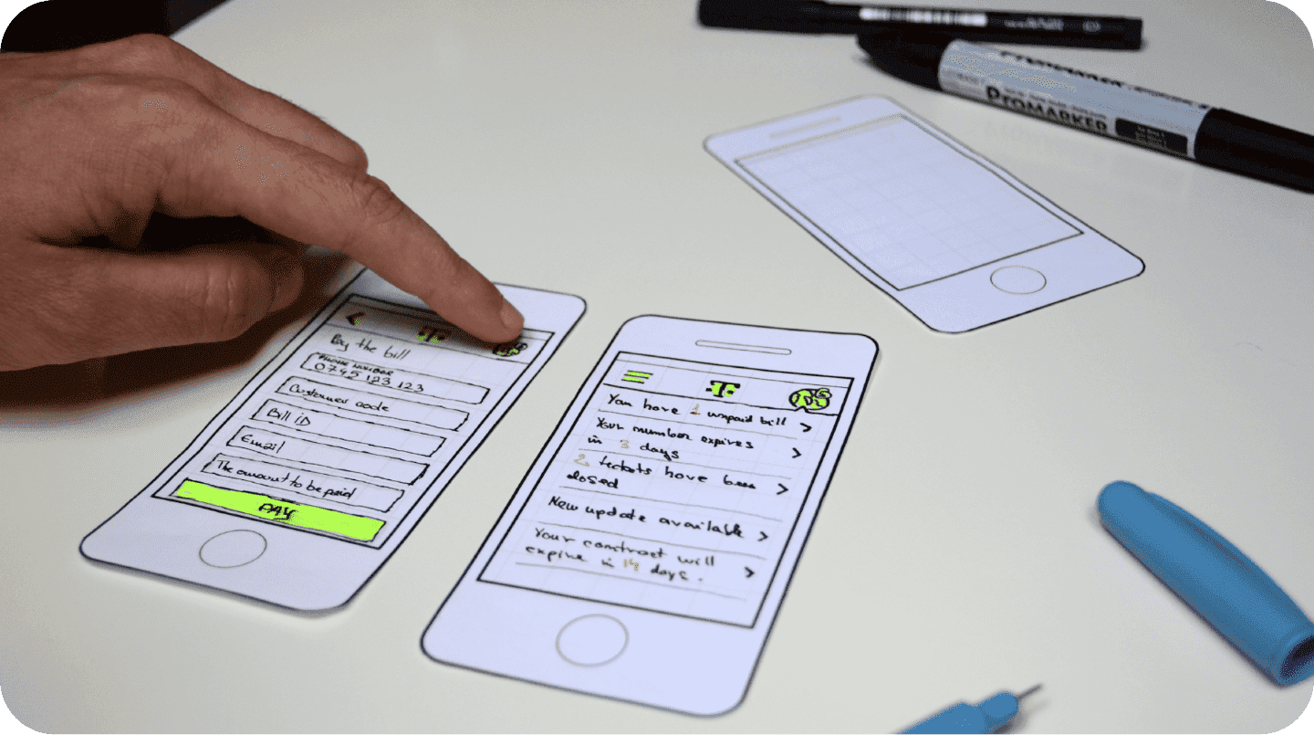
From this point on, the pencil was our best friend. We tried to avoid as much as possible the “let’s make a spreadsheet” curse, so we traced the flow and iterated in a quick’n’dirty fashion to get things moving. We had to be realists as time was on the essence.
Process
Sketching
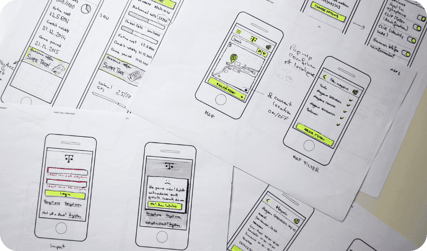
Having the flows traced we started sketching the main screens. We have our own way of sketching using pencils, thin-liners, dark, yellow and of course gray markers. You can’t speak UX without a gray marker.
After finalizing the sketches we tested them out to make sure they “feel” right. What didn’t fit the purpose, we redrew. Finally we approved and got feedback from the client as it was necessary for all parties involved to be on the same track.
Process
Visual style
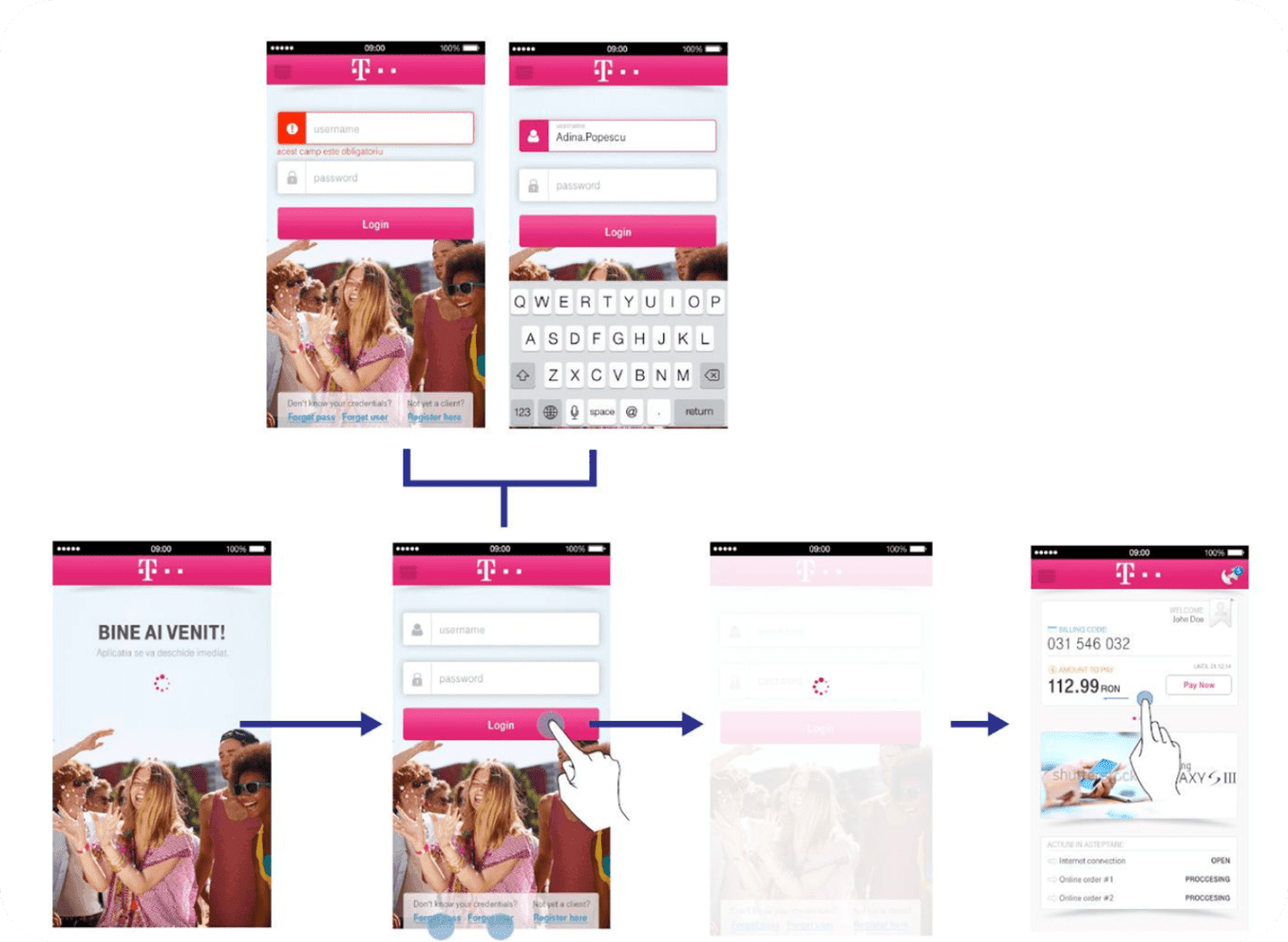
The next step for us was to draw a visual style for the application. At first we went for “a pure flat, don’t break the rules” approach. And we failed. Neither the client nor we were happy. So we learned to respect the guidelines, but on the same time bend them to create a better and friendlier visual style – especially when the app had to look the same on both Android and iOS. This indeed involved a few iterations, but we got it the way it felt right for the user.
Process
Testing with Skala
Drawing the mockups was not enough for us. We had to make sure that everything we worked on fit just perfect. So before sending the screens to the client for final approval, we tested them internally on devices using the Skala app. This way we made sure that the font hierarchy, colors and layout worked together just fine.
Process
Slice
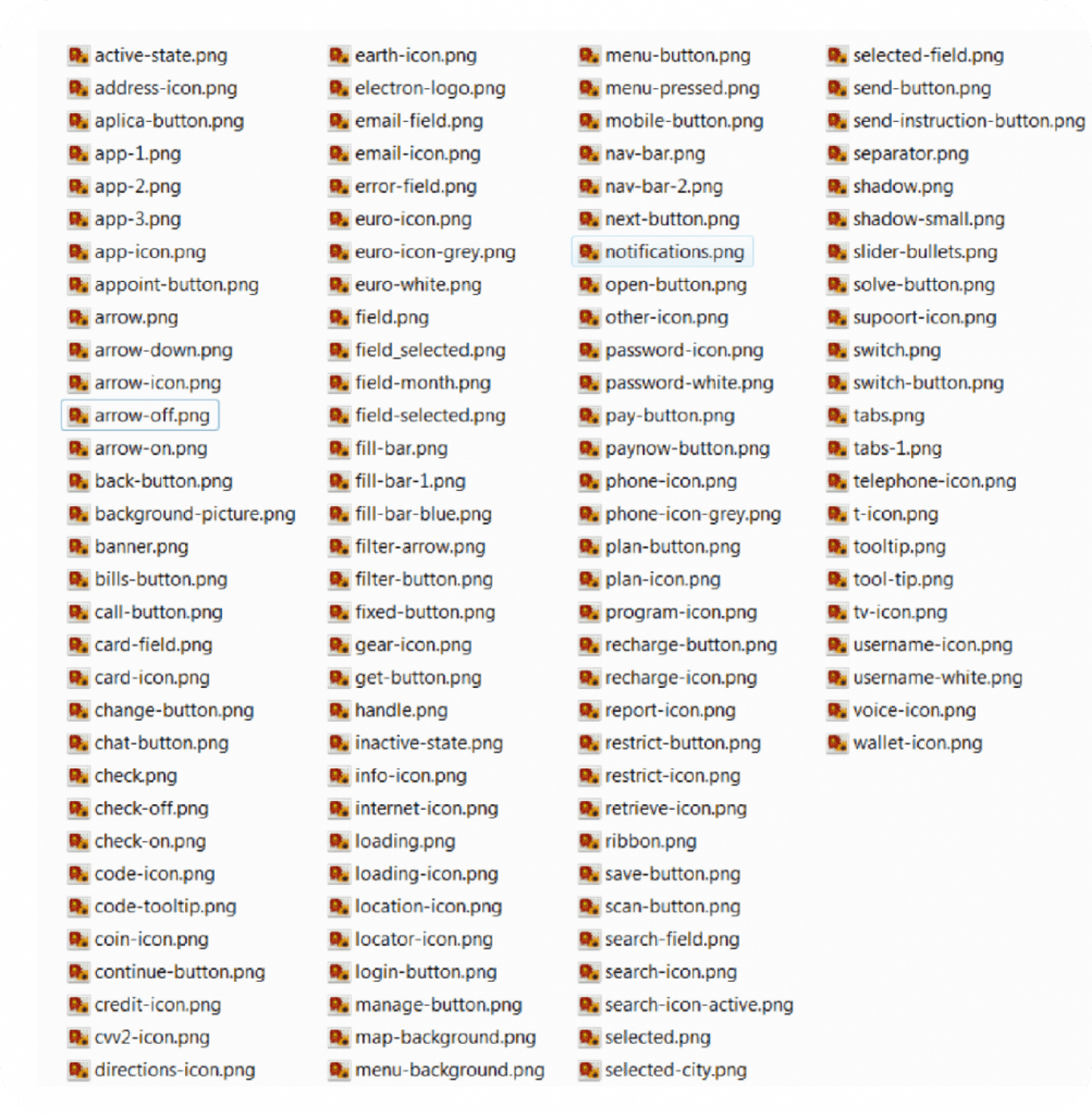
The final step for us was to prepare the assets for the development team. For iOS was plain simple as we only had to handle retina and non-retina (at this time the new iPhones weren’t launch yet). The tricky and most time-consuming part was preparing the files for Android (You might as well say “Just export them using a plugin or something”, but we had to make sure the same experience stayed consistent on all platforms, especially when dealing with a variety of densities: ldpi, mdpi, hdpi, xhdpi, xxhdpi and so on.
What happened next
Looking forward
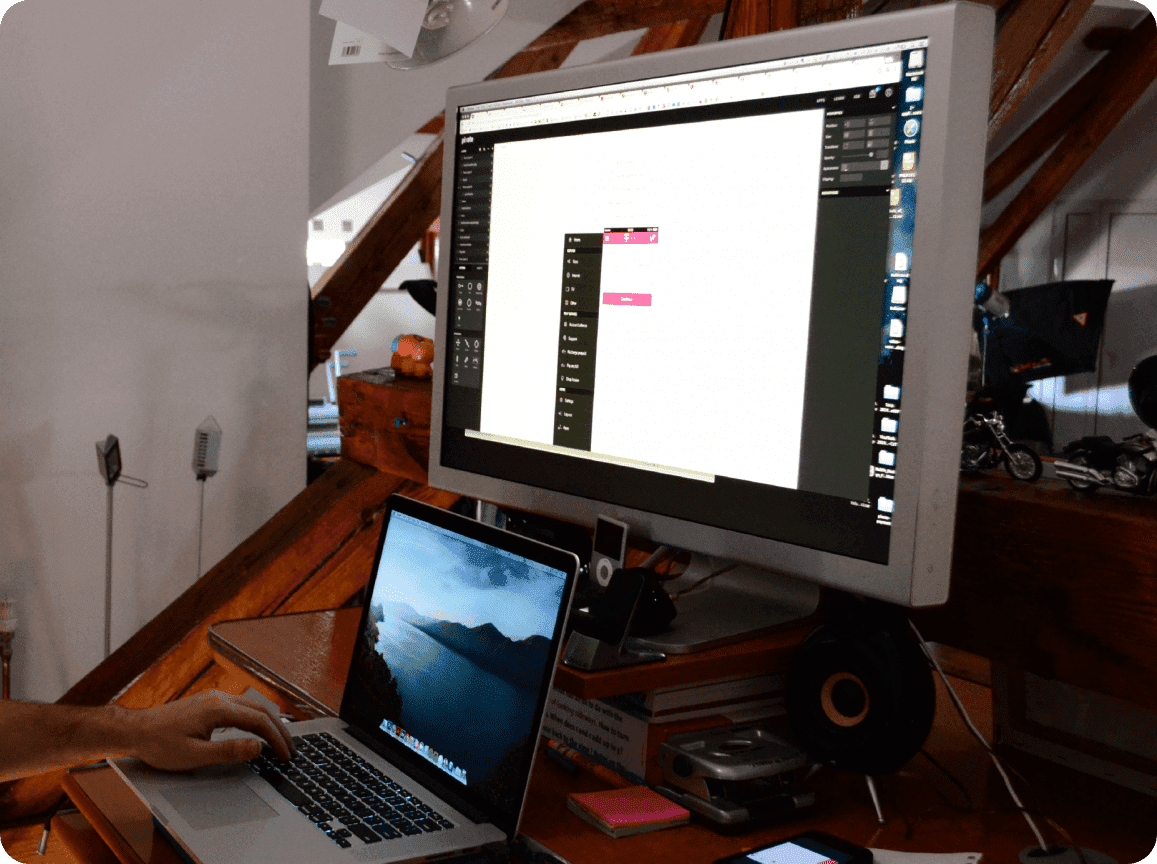
With this project we got around to test a few prototyping tools that we will definitely enjoy using on our next projects. This involved Marvel, InVision and Pixate. Marvel is a great tool for creating quick animations and syncing them with the device. We enjoyed InVision especially since we worked collaboratively, but the biggest surprise came from Pixate. It’s the “Axure of mobile prototyping”. It is a bit expensive, but using it we got to recreate interactions such as the menu drawer or notifications dropdown. But I’ll stop now, more on these tools in a separate case study.
What happened next
Conclusions
There were almost two years of hard work with great people, many sleepless nights, knowledge-sharing of all kinds, a lot of fun and good cookies. We also we got to test out new tools and techniques, hired and trained new people. It was not easy on either us or our dear ones, but looking back now, it was all worth it and would be ready it to do it again!
What we delivered
- User flows and use cases
- Sketches and tested mockups
- Cross-platform visual style
- Development-ready assets for iOS and Android